Chicago’s “Disappearing Middle Class” Can Be Found in Its Proliferating Upper Middle-Class Neighborhoods

Chicago’s middle class isn’t disappearing; it’s much better than that.
In a recent report with Stephen Rose, I argued that the narrative of a “shrinking middle class” was based on a kernel of truth, but one that undermines economic pessimism. We showed that while 36 percent of families were part of what we called the “core middle class” in 1979, the share had fallen to 31 percent by 2024. However, the share of families who fell short of the middle class shrank even more. The middle class has not been hollowed out; rather, the overall decline stems from the net movement of families upward into the upper-middle class. That group, with incomes between 5 and 15 times the 2024 federal poverty guidelines, rose from 10 percent of families in 1979 to 31 percent in 2024.
Analyses that find a hollowed-out middle invariably rely on definitions of the middle class that peg thresholds to how the typical family is doing. In that case, even if everyone is better off over time in inflation-adjusted terms, if the middle’s gains are stronger than those of families lower down, more people can fall short of “the middle.” The Pew Research Center, for example, found that the share of families that were “lower-income” rose between 1971 and 2023, even though the purchasing power of those lower-income families rose by 55 percent. The explanation for this seeming paradox is that “middle-income” families saw a 60 percent gain, making it harder to reach the middle-income threshold if income rose more slowly than that.
The point of my paper with Rose was that claims of a “hollowing out” of the middle class wrongly reinterpret widespread gains across the income distribution as rising insecurity and declining living standards. Unbeknownst to us, a perfect example of this misinterpretation appeared a week before we published our report in Chicago magazine. The offending article title blared that “Chicago’s Middle Class Is Disappearing.” My reanalysis of the data behind the piece indicates it would be difficult to articulate a more misleading conclusion. Fewer Chicagoans live in middle-class neighborhoods than in 1970—but only because more live in richer neighborhoods.
The Chicago article illustrates “the trajectories of the rich and poor in Chicago” by describing homeless persons panhandling around the corner from $800,000 houses. It quotes a demographer asserting that, “The middle class is declining because the top 10 percent is swelling…and the bottom 20 percent is swelling.” The piece concludes, “As America races toward extremes of rich and poor, Chicago is racing even faster.”
The piece included no hard numbers on trends (nor did it explain how the bottom 20 percent can ever “swell” to more than one in five people). But it linked to another article on the local public radio website (WBEZ) cheerily titled, “The Middle Class Is Shrinking Everywhere — In Chicago It’s Almost Gone.” Both included maps created by the University of Illinois at Chicago’s Nathalie P. Voorhees Center for Neighborhood and Community Improvement, which paint an alarming picture:

Source: Nathalie P. Voorhees Center for Neighborhood and Community Improvement, College of Urban Planning and Public Affairs, University of Illinois Chicago, https://voorheescenter.uic.edu/chicago_communities/.
The growth of very high-income census tracts (which you can think of as large neighborhoods) is apparent in the spread of dark blue areas. But what really stands out is the spread of very low-income census tracts (red/orange). The beige middle-class tracts do, indeed, seem to disappear. The Voorhees Center data indicate that the share of Chicago tracts that were middle-income fell from 50 percent in 1970 to just 16 percent in 2017. Meanwhile, the share of lower-income tracts rose from 42 percent to 62 percent, and the share of higher-income tracts rose from 8 percent to 22 percent. Sounds pretty bad!
This bidirectional exodus from the middle is what populists on both the left and the right have in mind when they bemoan the hollowing out of the middle class. But the Voorhees Center methodology has the same shortcoming as Pew’s analyses of the shrinking middle class. Both define middle-class status relative to a benchmark that changes over time and is tied to typical contemporary income. If everyone’s income doubles, the middle class is no larger, yet everyone’s income has doubled.
In our paper, Steve and I argue that, for the purpose of assessing how much better off families are, using absolute thresholds to define classes makes far more sense. Everyone’s income doubling moves people out of lower classes and into higher ones, accurately depicting the rise in living standards.
To assess the claims around the Voorhees Center data and see how the conclusion changes when using absolute thresholds, I turned to two artificial intelligence (AI) assistants—the first time I have relied on AI for data analysis. I primarily used Claude, Anthropic’s assistant, and relied on OpenAI’s ChatGPT to check the code Claude produced.
I first set out to replicate the original analysis. The methodological details for the Voorhees Center analysis are sparse. The thresholds defining the five classes are shown in the graphic above and in other graphics online. The researchers estimated per capita income for each census tract in the city. They then compared each tract's income to the per capita income for seven counties in the Chicago metropolitan area. (These seven counties only comprise part of today’s metro area, which includes 14 counties, and only six of the seven were in the 1970 definition of the metro area. Planning agencies in Chicago generally refer to the seven-county “metropolitan region.”) The Voorhees Center researchers created five classes, separated by thresholds pegged to percentages of metro income. For our purposes, the key thresholds define the middle class: per capita income of at least 80 percent but no more than 120 percent of the metro per capita income.
Except for the 2017 results, their estimates are based on decennial census data aggregated at the tract level. Census tract boundaries can change over time, but the Brown University Longitudinal Tract Database (LTDB) holds them fixed so that shifts in the tract definitions don’t affect results. The Voorhees Center analysts held the boundaries at their 2010 definitions. The 2017 estimates are from the American Community Survey (ACS), conducted annually, with tract-level totals based on five years of aggregated data. Those tract-level estimates already reflect 2010 boundaries.
Claude obtained the 1970 tract estimates for the Chicago metro area from the LTDB, 2017 estimates from the 2013-2017 ACS data on the Census Bureau website, and 2010 Chicago city and census tract shapefiles (for mapping) from the Census Bureau. It produced Python scripts to analyze the data and create census tract maps for 1970 and 2017. As with fully human analyses, the process involved numerous iterations to correct mistakes and refine the methods, aided by ChatGPT’s review of the Python code and this human’s substantive knowledge. The code is available on request, but I can’t interpret it for you as I don’t know Python!
On to the results. According to a chart attributed to the Voorhees Center, in 1970, 42 percent of tracts in the city of Chicago were “lower income” (combining the “low income” and “very low income” categories), 50 percent were “middle income,” and just 8 percent were “higher income” (combining “high income” and “very high income”). I believe that, rather than these percentages being the share of tracts, they are the percentage of Chicago’s population living in these tracts. My replication attempt estimated these figures at 42 percent, 51 percent, and 7 percent—extremely similar.
Moreover, the map that Claude produced (on the right) also very closely resembled the original Voorhees Center map (on the left):
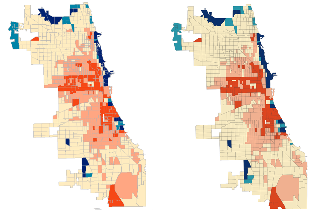
Chicago census tracts by income class, 1970. Shading ranges from red/orange (very low income, or under 60% of the metro average individual income) to salmon (low income, or 60-80% of the metro average) to beige (middle income, or 80-120% of the metro average) to teal (120-140% of the metro average) to dark blue (above 140% of the metro average). The original is on the left; my replication attempt is on the right. Original is from the WBEZ website, based on Jessica Kursman and Nick Zettel, “Who Can Live in Chicago? Part I,” Voorhees Center for Neighborhood & Community Improvement, June 6, 2018. Unpopulated tracts are omitted.
The replication was also successful for 2017. Whereas the Voorhees Center found the lower-income share rising to 62 percent, the middle-income share falling to 16 percent, and the upper-income share rising to 22 percent, my replication produced estimates of 60 percent, 19 percent, and 22 percent. Here are the maps:

Chicago census tracts by income class, 2017. Shading ranges from red/orange (very low income, or under 60% of the metro average individual income) to salmon (low income, or 60-80% of the metro average) to beige (middle income, or 80-120% of the metro average) to teal (120-140% of the metro average) to dark blue (above 140% of the metro average). The original is on the left; my replication attempt is on the right. Original is from the WBEZ website, based on Jessica Kursman and Nick Zettel, “Who Can Live in Chicago? Part I,” Voorhees Center for Neighborhood & Community Improvement, June 6, 2018. Unpopulated tracts are omitted.
Reassured of Claude’s ability to analyze the data, I next determined how the size of the middle class changed when using absolute rather than relative thresholds. I determined the income levels corresponding to the 1970 thresholds, which were $20,942, $27,923, $41,885, and $48,865 (in 2025 dollars). I used the Personal Consumption Expenditures price index for the inflation adjustment. Note that the 1970 census data actually record income from 1969.
Then I used the same real (inflation-adjusted) thresholds for 2017. That means that instead of “middle income” requiring 80 to 120 percent of the 2017 metro average income, it requires 80 to 120 percent of the 1970 metro average income (adjusted for inflation to keep income in terms of constant purchasing power). Using this approach, the share of people living in middle income tracts fell in half from 1970 to 2017—from 51 percent to 25 percent. The share living in tracts below the middle income was roughly constant—42 percent in 1970 and 43 percent in 2017. In contrast, the share living in tracts above middle income more than quadrupled, rising from 7 percent to 31 percent. The resulting maps (1970 on the left, 2017 on the right) show significant growth in the number of tracts above and below middle income. However, the tracts below the middle income lost population. The number of lower income tracts spread, but fewer people lived in them.

Chicago census tracts by income class, 1970 and 2017, using fixed class thresholds. Shading ranges from red/orange (very low income, or under 60% of the 1970 metro average individual income) to salmon (low income, or 60-80% of the 1970 metro average) to beige (middle income, or 80-120% of the 1970 metro average) to teal (120-140% of the 1970 metro average) to dark blue (above 140% of the 1970 metro average). The 1970 map is on the left; the 2017 map is on the right. Unpopulated tracts are omitted.
Remember that “2017” here actually refers to 2013-2017, which includes the middle of the economic recovery following the Great Recession. The national unemployment rate was 4.9 percent in 1970, while it averaged 5.6 percent from 2013 to 2017. If we instead use 2015-2019 as the end point (average national unemployment rate of 4.4 percent), the middle income share falls from 51 percent to 26 percent, the lower-income share falls from 42 percent to 36 percent, and the higher income share jumps from 7 percent to 38 percent.
Finally, we can use the most recent data available, which are from 2020 to 2024. Over this period, unemployment averaged 4.9 percent—the same as in 1970. The analysis of the ACS data requires converting Chicago’s 2020 census tract boundaries back to the 2010 definitions, which Claude did using a Census Bureau crosswalk file, apportioning income and population from 2020 tracts to 2010 tracts based on their geographic overlap. Only about 8 percent of Chicago tracts had to be split, while another 8 percent were combined.
From 1970 to 2024, the share of Chicagoans who lived in middle income tracts fell from 51 percent to 25 percent. The share living in tracts falling short of middle income dropped from 42 percent to 28 percent. Meanwhile, the share living in upper income tracts rose sevenfold—from 7 percent to a whopping 48 percent. Looking at the top group, very high income tracts were home to just 4 percent of Chicagoans in 1970 but 38 percent in 2024.

Chicago census tracts by income class, 1970 and 2024, using fixed class thresholds. Shading ranges from red/orange (very low income, or under 60% of the 1970 metro average individual income) to salmon (low income, or 60-80% of the 1970 metro average) to beige (middle income, or 80-120% of the 1970 metro average) to teal (120-140% of the 1970 metro average) to dark blue (above 140% of the 1970 metro average). The 1970 map is on the left; the 2024 map is on the right. Unpopulated tracts are omitted.
The commentators wielding the Voorhees Center data are not wrong when they declare that Chicago’s middle class is shrinking. However, it doesn’t follow that everyone now is either struggling or affluent. Fewer Chicagoans live in middle income neighborhoods today because more of them live in upper income neighborhoods. Happily, fewer people also live in lower income neighborhoods than in the past.
Researchers who allow class thresholds to rise as incomes rise get results that reflect not just changes in living standards but also changes in inequality. Surely both trends are important, but they are separate aspects of economic well-being. If the rich were getting richer while the middle class and poor were getting poorer, we might worry that rising inequality was hurting living standards. However, what has really happened is that the entire distribution of income has shifted upward—just more at the top than at the middle, and more at the middle than at the bottom. The rich have gotten richer, and the middle and poor have gotten richer.
To simply characterize the result as a “disappearing middle class” or to think it necessitates asking, “Who can live in Chicago?” is to presume that rising inequality has left the middle class worse off and swelled the ranks of the poor. In reality, per capita income in the median Chicagoan’s census tract rose from $29,600 in 1970 to $39,300 in 2024 (both in 2025 dollars)—an increase of one-third. Using relative thresholds and letting class thresholds increase over time, the average Chicagoan in a lower income census tract lived in a tract with a per capita income of $22,300 in 1970 but $27,800 in 2024 (25 percent higher). For Chicagoans in middle income tracts, the increase was from $32,400 to $49,900 (54 percent). That is hardly the impression conveyed by headlines about a disappearing middle class.
If we ask whether neighborhoods meet the standard of middle class income that prevailed in 1970, Chicago looks like the nation. The middle is shrinking because neighborhoods are moving up, not because they’re being hollowed out. Nearly half of Chicago’s tracts now exceed what would have been the higher income threshold in 1970. Fewer than 30 percent fall below what would have been the middle income threshold.
None of this is to deny that Chicago, like many American cities, faces real challenges related to concentrated poverty, residential segregation, and uneven development. Some neighborhoods have indeed been left behind in both relative and absolute terms. But the aggregate picture is one of broad, if unequal, progress. Decrying a hollowed-out middle is just a gloomy way of acknowledging that the upper middle class has boomed.
One final note related to AI. The analysis here was both easier and more difficult than I expected. Initially, ChatGPT kept changing as it tried to produce my results. With the benefit of experience coaxing ChatGPT, I obtained maps of Chicago in Claude ridiculously easily, though ChatGPT then found a handful of fairly large errors in the Claude code. I recognized issues that neither assistant caught. Extra tokens were purchased and burned through.
Data analysis remains too tricky for AI-assisted amateurs, which should both reassure seasoned researchers about their own value and inspire fear about the damage that overconfident dilettantes can now inflict by telling Claude to answer an empirical question as if it were Alexa setting a timer.
But, man oh man. Having spent quite a lot of time on the Chicago project, it was simply stunning to then watch Claude produce these charts in under seven minutes after telling it,
Now repeat the 1970-to-2024 analyses for New York City (all 5 boroughs) using inflation-adjusted thresholds based on the same 1970 percentages of metro per capita income used in the Chicago analyses, but this time using the New York metro area (across multiple states, as it was defined in 1970). Provide the percentage distributions across the 5 income categories in both years and the 1970 and 2024 maps of New York City. Use all the same analytic and presentation decisions we made for the Chicago analyses. Provide the code.

New York City census tracts by income class, 1970 and 2024, using fixed class thresholds. Shading ranges from red/orange (very low income, or under 60% of the 1970 metro average individual income) to salmon (low income, or 60-80% of the 1970 metro average) to beige (middle income, or 80-120% of the 1970 metro average) to teal (120-140% of the 1970 metro average) to dark blue (above 140% of the 1970 metro average). The 1970 map is on the left; the 2024 map is on the right. Unpopulated tracts are omitted.
And if you’re curious, the share of New Yorkers in lower income, middle income, and higher income tracts went from 43/43/14 to 21/33/46 from 1970 to 2024. Fortunately, it looks like the middle class really is shrinking everywhere.
Scott Winship is a senior fellow and the director of the Center on Opportunity and Social Mobility at the American Enterprise Institute. He is a contributing editor to Civitas Outlook.


New York City Is Mamdani’s Economic Fantasy Land
It will take a sustained effort for New York’s progressive, now socialist left, to rethink the errors of their ways before they learn the hard way.

Washington’s Debt Is Falsely Measured
The federal government's debts can only be repaid from what it collects. Measuring those debts against anything else isn’t analysis, it’s marketing.

A Tech Republic, If You Can Keep It
The only real threat to American tech dominance is America itself.


.png)


Get the Civitas Outlook daily digest, plus new research and events.
Get the Civitas Outlook daily digest, plus new research and events.