
The Shrinking Middle Class and Booming Upper-Middle Class: The Plot Thickens

It is simply and grossly inaccurate to suggest the American middle class is shrinking.
Earlier this year, our report, “The Middle Class Is Shrinking Because of a Booming Upper-Middle Class,” argued that the narrative of a “hollowed-out middle class” rests on counterintuitive class definitions and misinforms about economic deterioration. If you define the middle class such that doubling everyone’s income makes it no easier to enter the middle class, then you can get a hollowed-out middle class if income growth is slower for poorer families than for the typical family. For example, in a 2024 Pew Research Center analysis, the “lower-income” group grew in size between 1971 and 2023 even though its average income rose 55 percent. That’s because the income of the shrinking middle-income group rose by 60 percent, so the entry point for the middle class rose faster than did incomes lower down.
We argued that defining the middle class this way obscures substantial increases in living standards across the income distribution. When we set thresholds for five classes that changed only as the cost of living rose, we too found a shrinking middle class. While 36 percent of families were in the “core” middle class in 1979, by 2024, just 31 percent were. However, the share of families too poor to reach the core middle class also declined, from 54 percent to 35 percent. The reason the core middle class shrank was that the upper-middle class boomed, tripling in size from just 10 percent of families in 1979 to 31 percent in 2024. Inequality rose, but not because the poor got poorer—even near the bottom, incomes rose by 29 percent.
Our paper received widespread attention, attracting a Wall Street Journal editorial, mentions by columnists in the Journal and New York Times, a front-page Journal article, and appearances in various other outlets. Much of the commentary focused on why the public mood seems at odds with the claim that so many Americans have ascended into the upper-middle class.
Other critics suggested that it was all well and good that incomes were rising, but we’d have concluded differently if we’d looked at wealth instead of income. Wealth reflects a stock of resources that has accumulated over time. If you save or invest your income, you’ll increase your wealth. If the flow of income stops, you are still left with your wealth (though wealth can be negative if debts exceed assets). Wealth is distributed less equally than income, and wealth inequality has probably risen more, though this conclusion is sensitive to how income and wealth are defined.
So let’s address these issues. Starting with wealth, we turned to the Federal Reserve Board’s Survey of Consumer Finances. This survey is administered every three years, and consistent results are currently obtainable between 1989 and 2022. We used a conventional definition of wealth—net worth, or assets minus debt. We defined the family in terms similar to those in our income paper, including single people living without relatives as one-person families and combining the families and incomes of cohabiting romantic partners. We also size-adjusted family wealth as in our income paper (by converting wealth to family-of-three equivalent amounts) and measured inflation the same way (using the personal consumption expenditures price index to convert all wealth figures to constant 2024 dollars).
This left the question of how to define classes. When the entire distribution of income or wealth moves up, a wide range of thresholds will capture the improvement in living standards. The choice of where to set them is somewhat arbitrary. In our income paper, we set the thresholds in relation to the 2024 federal “poverty guideline” for a family of three and held them fixed in real terms for every year we analyzed. For the wealth analyses, we set our 2022 thresholds to reproduce the distribution of family income across our five classes in 2022. Then we held them fixed in real terms for 1989.
The five classes, then, are poor/near-poor (less than $20,285 in 2024 dollars), lower-middle class ($20,285 to $115,254), core middle class ($115,254 to $620,268), upper-middle class ($620,268 to $7,414,445), and wealthy (above $7,414,445). If these seem somewhat high, remember that they are in family-of-three equivalents, and the typical family has fewer than three people, which means our adjustment pushes many wealth amounts upward. We could have put them in family-of-two equivalents and they would be lower, but the results would not be meaningfully affected.
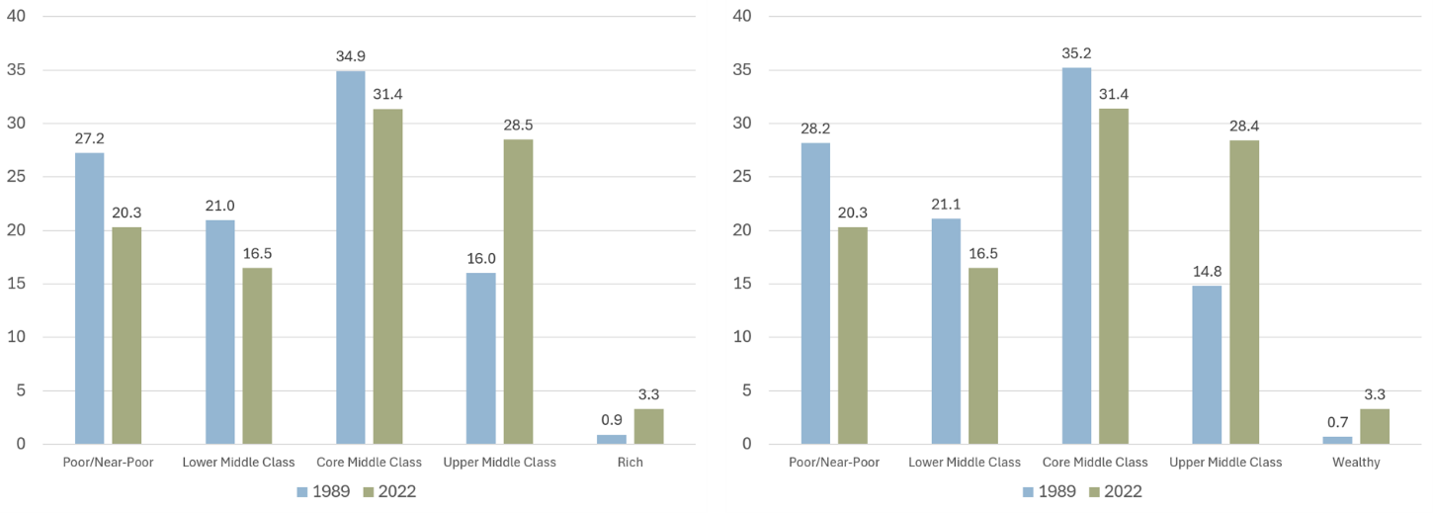
Our income paper looked at trends from 1979 to 2024. If we consider 1989 to 2022 instead, we find that the share of families whose income fell short of the core middle class declined from 48 percent to 37 percent, the share who were middle class fell from 35 percent to 31 percent, and the share who were upper-middle class rose from 16 to 29 percent. (The group we call rich rose from 1 percent to 3 percent.) In short, the upper-middle class boomed while lower-income groups (including the core middle class) shrank.
What do the new figures based on wealth show? The results are nearly identical. The 2022 figures are identical by design, since we set the thresholds to reproduce the family income distribution. But there is no reason that the 1989 wealth figures should be similar to the income ones. Nevertheless, they are. While 49 percent of families in 1989 had below-middle-class wealth, only 37 percent did in 2022. The core middle class fell from 35 percent to 31 percent. In contrast, the upper-middle-class share rose from 15 percent to 28 percent. (Actually, the 2022 share is 28.4 percent, which is approximately the same as the 2022 income figure of 28.5 percent.)
Figure 1. Share of Families in Each Class, 1989 and 2022, Income (Left) vs Wealth (Right)
We also conducted alternative analyses to address two concerns. First, wealth increases with age, and the aging of the baby boomers could affect the class trend in important ways. However, when we confined the analyses to families with heads between the ages of 35 and 54 (keeping the thresholds the same as before), the results told the same story: the below-core-middle-class group fell from 43 percent to 36 percent, the core middle class shrank from 42 percent to 38 percent, and the upper-middle-class group rose from 15 percent to 24 percent.
Second, student loan debt, which has increased over time, is treated differently by conventional wealth measures than other debt. The mortgage debt of Americans who take out a loan to purchase a home is properly counted as negative wealth. But at the same time, the value of the home that the loan finances is counted as an asset, positive wealth. The same is true of car loans and cars.
Educational investment should be treated more like a mortgage than like credit card debt. Student loans are taken out to invest in skills and knowledge that will pay off in higher lifetime earnings. The loans are counted as negative wealth in conventional measures. However, the more valuable human capital that was the whole point of taking out a loan is invisible as positive wealth.
Removing educational debt doesn’t change the story, though, either. The distribution shifts from 49/35/15 in 1989 (under-core-middle/core-middle/upper-middle) to 35/33/29 in 2022. The upper-middle class expands while the less wealthy groups shrink. Removing student loan debt and confining to family heads ages 35 to 54 also yields the same conclusion.
Analysts who prefer the Pew method of pegging class thresholds to how the middle class is doing might say that our approach fails to account for the importance of how families are doing relative to their contemporaries. Even when incomes rise by the same amount across the board, families lower down may feel the middle class is no more within reach than it used to be. But even if true, this is a point about inequality rather than living standards.
The general increase in income and wealth we found was not experienced equally across all families. For instance, the share of wealth held by the lower-than-middle-class groups and the core middle class fell from 24 percent in 1989 to 8 percent in 2022. Strikingly, the share held by the upper-middle class also fell, from 50 percent to 39 percent. Meanwhile, the share of wealth held by the top group more than doubled, rising from 26 percent to 54 percent.
While these levels of wealth concentration are certainly striking, the increase in the top group’s share is mostly driven by the increase in the share of families it contains. The top group was just 0.7 percent of families in 1989 but 3.3 percent in 2022. If we look instead at the change in the share of wealth held by the top 3 percent over this period, the increase was from 45 percent to 52 percent. If we restrict to families with a head between the ages of 35 and 54, the increase in the top 3 percent’s share was just from 41 percent to 44 percent.
Other ambiguities also contribute to the trend. For instance, conventional wealth measures do not treat promised Social Security or Medicare benefits as assets, but if these programs had never existed, Americans would save more for retirement, and this private savings would be counted as assets. Research shows that incorporating future social security benefits into wealth dramatically reduces the rise in wealth inequality.
Nevertheless, even if we take our inequality trend at face value, it does not change the conclusion: the middle class has not been hollowed out. The inflation-adjusted wealth of the typical family more than doubled over the years we examine—increasing 109 percent—even though inequality rose sharply.
So, to return to the other criticism we received, why do so many Americans believe we are living through bad economic times? Exhibit A for the “vibecession” is the recent collapse of consumer sentiment, which reached an all-time low in May. In April, nearly half (47 percent) of Gallup respondents rated national economic conditions “poor.” You have to go back to the depths of the Great Recession (2010 and 2011) to find another April survey in which Gallup recorded more negative perceptions.
What’s strange is that most objective measures—not just ours—suggest that the economy is serving Americans well. A good indicator of how well typical workers in the US are paid is the hourly wages of production and nonsupervisory workers. According to the Bureau of Labor Statistics, the real wages of this group—that is to say, wages after taking inflation into account—were higher in March than in any previous March. (As in our other analyses, we use the Bureau of Economic Analysis’s personal consumption expenditures price index to adjust for inflation.) Real wage growth since 2019 has been stronger for lower-wage workers than for higher-wage workers. The unemployment rate in March was just 4.3 percent, better than at any point between March 1970 and March 1998 and between June 2001 and August 2017.
Other measures, such as the decline in the personal savings rate, are heavily affected by what’s happening at the top of the income distribution. The top fifth of households accounted for pretty much all savings in 2004 and over 90 percent in 2019. Between those years, the savings rate of the bottom 80 percent rose from 0 percent to 1.8 percent, while for the top quintile it rose from 21.6 percent to 25.8 percent. Savings, like income and wealth, are concentrated at the top. Because of this fact, a back-of-the-envelope calculation suggests that something like two-thirds of the rise in the personal saving rate was accounted for by the increase among the top quintile. It stands to reason that the recent fall in the personal savings rate is also dominated by the top fifth, though testing this conjecture is beyond the scope of this report. [Source: Tables A2b and A3b from https://bls.gov/osmr/research-papers/2024/pdf/ec240050.pdf. We define savings here as disposable personal income minus personal consumption expenditures, which isn’t quite right because it omits some “other personal outlays,” as discussed in the paper. However, it is accurate enough to establish the general points.]
What accounts for this disconnect between perception and reality? One issue is the difficulty of interpreting data, as illustrated by the personal savings rate. As another example, the decline in consumer sentiment, while real, is overstated by a methodological change in the relevant survey.
Another issue is that social media spreads doomsday charts that are often based on questionable or inaccurate data (when the data are sourced at all). One dubious chart from Moody’s has spread widely and fueled claims of a “K-shaped” economy, in which upper-income Americans are moving up while lower-income families are moving down. Contrary to Moody’s claim, the top 10 percent’s share of spending doesn’t appear to have risen at all. The algorithm loves negativity.
A third issue is that prices are higher after the post-pandemic bout of inflation, the tariff policies of the Trump and Biden administrations, and the more recent Iran-war-driven inflation. Consumer sentiment seems to be more sensitive to inflation than it is to increases in nominal wages. Wages are prices, too, and they rise with inflation. They have, in fact, risen faster than prices generally. But consumers tend to notice higher wages less than they do higher prices of goods and services.
Finally, perceptions about the economy also seem to be driven by misperceptions of how other Americans are doing. While nearly half of Gallup respondents in April thought the national economy was doing poorly, just 19 percent rated their own personal financial situation poorly that same month. A Federal Reserve Board survey found that between 2019 and 2025, the share of people who said the national economy was good or excellent fell by 24 percentage points, but the share saying their own finances were okay or that they were living comfortably fell by just two percentage points. So consumer sentiment may capture well changes in how Americans think other Americans are doing, but it probably doesn’t capture well changes in how Americans think they themselves are doing.
The elevated prices since the pandemic are a testament to the fact that not everything is rosy with the American economy today. But whatever past-five-year problems the nation has, it is simply and grossly inaccurate to suggest the American middle class has the kind of past-50-year problems that are too often claimed.
Stephen J. Rose is a Research Professor at the George Washington Institute of Public Policy.
Scott Winship is a senior fellow and the director of the Center on Opportunity and Social Mobility at the American Enterprise Institute.

The Shrinking Middle Class and Booming Upper-Middle Class: The Plot Thickens
What accounts for this disconnect between perception and reality?
New York City Is Mamdani’s Economic Fantasy Land
It will take a sustained effort for New York’s progressive, now socialist left, to rethink the errors of their ways before they learn the hard way.
Washington’s Debt Is Falsely Measured
The federal government's debts can only be repaid from what it collects. Measuring those debts against anything else isn’t analysis, it’s marketing.


.jpg)


Get the Civitas Outlook daily digest, plus new research and events.
Get the Civitas Outlook daily digest, plus new research and events.